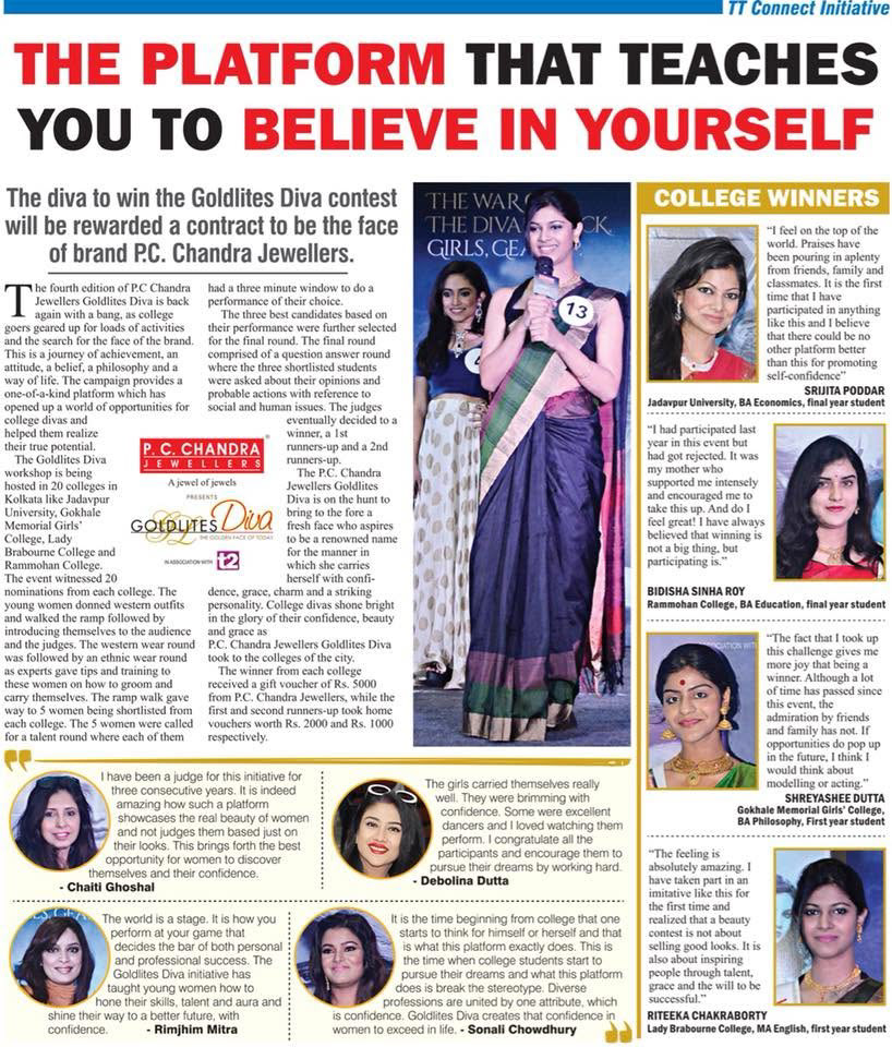
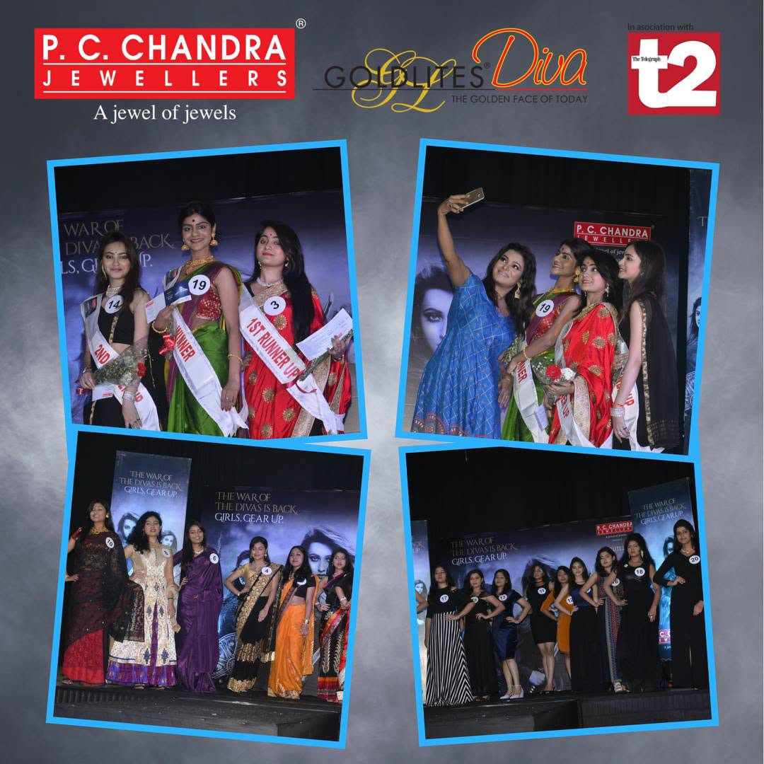
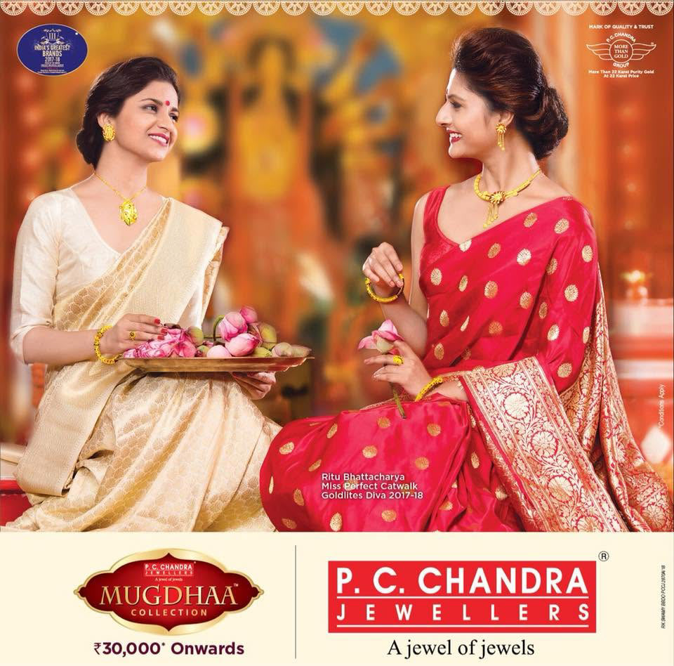
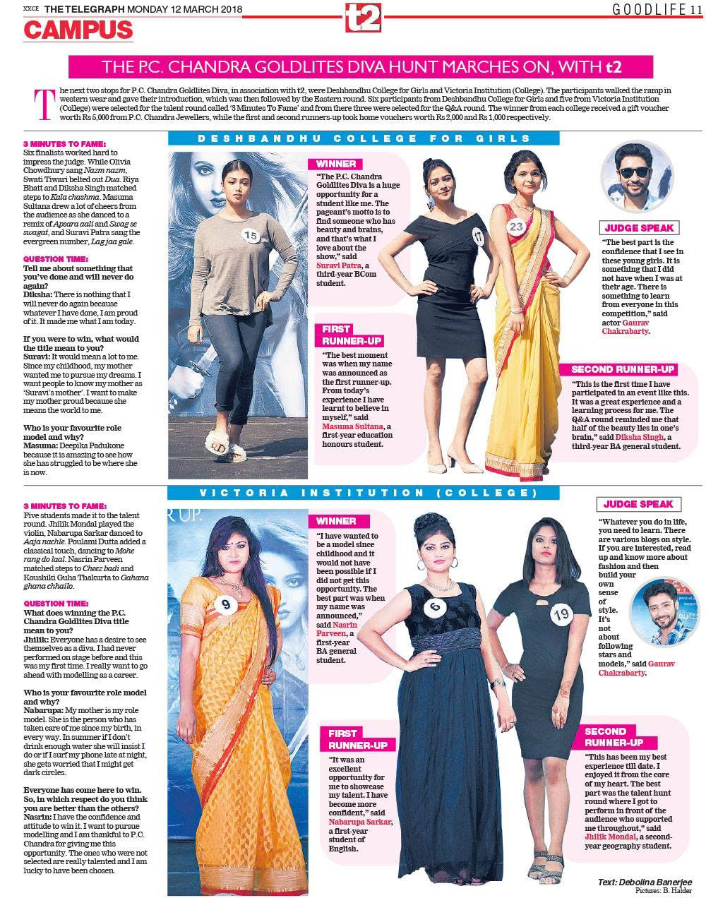
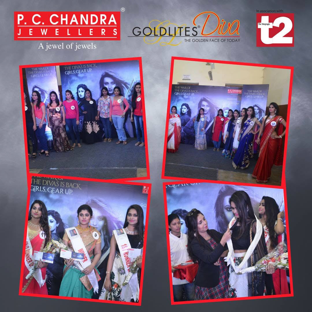
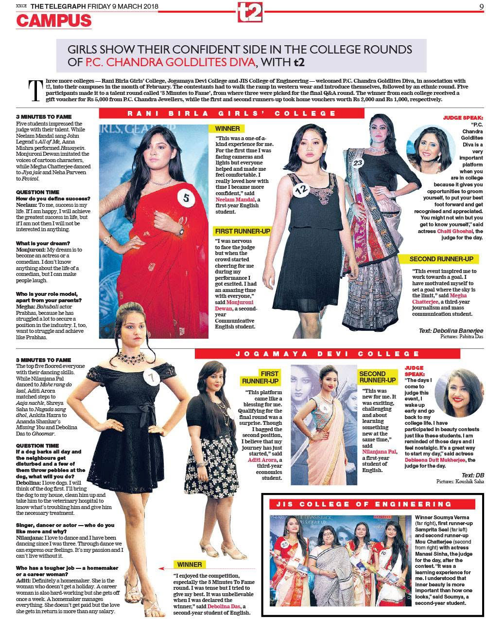
P.C. Chandra Goldlites Diva is one of Eastern India’s largest beauty pageants, created to celebrate confidence, individuality, and contemporary womanhood. I worked on the campaign during my time at ABP One, the ABP Group's integrated brand solutions agency. The brief required a glamorous, aspirational visual identity that could attract potential participants while carrying the prestige and recognition associated with P.C. Chandra Jewellers.
The campaign language combined fashion-led imagery with a clear information hierarchy. Strong portraiture, elegant typography, and a premium color palette established the pageant’s personality, while prominent calls to action kept registration and event details easy to find. A key challenge was maintaining this visual impact across formats of very different scales. Newspaper advertisements needed to communicate within a compact editorial environment, while hoardings required immediate recognition from a distance. The same design system was extended across print collateral and on-ground campaign assets, creating a consistent presence throughout the campaign.
The project shows how a unified visual language can turn a pageant into a recognizable cultural property, balancing glamour and aspiration with clear, action-oriented communication.
The campaign language combined fashion-led imagery with a clear information hierarchy. Strong portraiture, elegant typography, and a premium color palette established the pageant’s personality, while prominent calls to action kept registration and event details easy to find. A key challenge was maintaining this visual impact across formats of very different scales. Newspaper advertisements needed to communicate within a compact editorial environment, while hoardings required immediate recognition from a distance. The same design system was extended across print collateral and on-ground campaign assets, creating a consistent presence throughout the campaign.
The project shows how a unified visual language can turn a pageant into a recognizable cultural property, balancing glamour and aspiration with clear, action-oriented communication.
Brand: P.C. Chandra Goldlites
Campaign: Goldlites Diva
Agency: ABP One, ABP Group
My Role: Campaign and Communication Designer
Project Deliverables: Newspaper Advertisements, Hoardings, Print Collaterals and On-Ground Campaign Assets
Campaign: Goldlites Diva
Agency: ABP One, ABP Group
My Role: Campaign and Communication Designer
Project Deliverables: Newspaper Advertisements, Hoardings, Print Collaterals and On-Ground Campaign Assets